
IT company in Houston, Texashello@hawkonix.com
Start a project
Design & Cloud

UI/UX Design for Web Apps, SaaS and Mobile

UI/UX design services that produce screens your developers can build and your users can figure out on the first try: research, user flows, clickable Figma prototypes and a design system tied to real components.

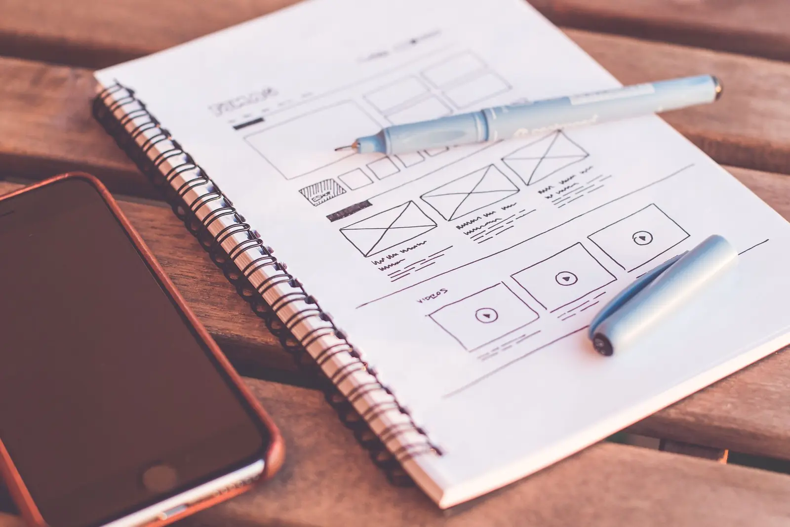
Designer sketching app wireframes on paper beside a laptop showing a design tool
Typical timelineTypically 3–10 weeks
Main toolFigma
CoversWeb, SaaS, mobile, POS screens
HandoffSpecs, tokens, component library

Good UI/UX design services are not about pretty mockups. They are about a cashier finding the refund button under pressure, a buyer reordering in three taps, or an admin understanding a report without a manual. We design that way because we build and support our own products, and we hear quickly when a screen is confusing. Support tickets, training calls and feedback from store owners tell us exactly which layouts work under real pressure and which ones slow people down.

Our designers work next to our engineers. That means every layout is checked against real data, real loading states and real screen sizes before it is handed off. You get designs that survive contact with development, and a design system that keeps your product consistent as it grows, whether your team or ours writes the code. We work with clients in Houston and across Texas in person, and with teams elsewhere over video and shared Figma files.

Research that answers specific questions

We do not run research for its own sake. We start with the decisions you need to make: which tasks matter most, where people get stuck, and what they use today instead. Then we pick the lightest method that answers those questions, from a few user interviews to analytics review, support ticket analysis or watching people use the current product.

For business software, the best insight often comes from sitting with the people who use it every day. Watching a warehouse clerk pick orders or a store manager close the day shows problems no survey will. We summarize findings in a short document with the top problems ranked by impact, not a slide deck nobody reads twice.

  • Stakeholder and user interviews
  • Analytics and funnel review
  • Support ticket and session recording review
  • Competitor and workaround audit

User flows, wireframes and information architecture

Before we color anything, we map how people move through the product. User flows show each step for key tasks, including errors, empty states and edge cases such as a declined card or an out-of-stock item. Information architecture decides what lives where in navigation, so features stay findable as the product grows.

Wireframes come next: low-detail layouts that let you judge structure and priority without arguing about fonts. They are fast to change, so this is where we try two or three options for the hardest screens. Changing a wireframe costs minutes. Changing a built screen costs days.

We also write the words at this stage. Button labels, field hints, error messages and empty-state text shape usability as much as layout does. Plain, specific copy such as "Card declined, try another card" beats a generic "Something went wrong" every time, and we draft it alongside the wireframes so it is reviewed early.

Visual UI design and clickable prototypes

Once structure is agreed, we design the visual layer in Figma: type scale, color, spacing, icons, and states for every interactive element. We design for real content lengths, long names and big numbers, and we check color contrast against WCAG 2.1 AA so text stays readable for people with low vision and on cheap screens in bright stores.

We then link screens into a clickable prototype. You can put it in front of users, investors or your sales team before a line of code is written. For mobile, we follow platform patterns from Apple and Google where they help, and we design touch targets large enough for gloved hands or a rushed checkout.

  • Responsive layouts for phone, tablet and desktop
  • Loading, empty, error and success states
  • Accessibility checks for contrast, focus order and labels
  • Prototype links for testing and stakeholder review

Design systems that developers actually use

A design system is a shared set of tokens and components: colors, type, spacing, buttons, inputs, tables, modals and the rules for using them. Done well, it makes new screens faster to design and build, and keeps the product consistent across teams.

We build Figma components with variants that match how front-end code is structured, and we export design tokens in a format your stack can consume, such as CSS variables or a Tailwind config. When we also build the front end, we create matching React or Vue components so design and code stay in sync. If you already have a system, we audit it and fill gaps rather than start over.

Every component is documented with when to use it, when not to, and its states: default, hover, focus, disabled, loading and error. That documentation is what keeps a new hire or an outside contractor from inventing a fourth style of dropdown six months from now.

UI/UX design services for complex business tools

We test prototypes with five to eight representative users per round, which is usually enough to find the biggest problems. Each session has set tasks, and we note where people hesitate, misclick or give up. We fix the issues and, for high-stakes flows, test again.

Much of our work is on dense business software: POS screens, back offices, dashboards and B2B ordering. These need different choices than a marketing site. Speed of repeat use matters more than first impressions, keyboard shortcuts matter, and tables must handle hundreds of rows. Our experience designing CornerHawk and Distrohawk screens shapes how we approach yours.

  • Task-based usability sessions with real users
  • Dense tables, filters and bulk actions
  • Keyboard shortcuts for repeat daily tasks
  • Dashboards that answer one question each

01Deliverables

What you get from us

Research summary

A short written report of what we learned from users, data and support logs, with the top usability problems ranked and linked to the screens they affect.

User flows and sitemap

Diagrams of every key task from start to finish, including error paths, plus a navigation structure that shows where each feature lives and why.

Wireframes

Low-detail layouts for all core screens, used to agree on structure, content priority and interaction before visual design begins, with options for the hardest screens.

High-fidelity UI

Final Figma screens for every breakpoint and state, using real content, checked for contrast and readability, organized in pages your team can navigate.

Clickable prototype

A linked Figma prototype of the main flows that you can share with users, investors or your sales team to test and demo before development starts.

Design system and handoff

Figma components, exported design tokens and annotated specs for spacing, behavior and states, so developers build what was designed without guesswork.

02Process

How the work runs, step by step

Kickoff and goals

We agree on the business goals, the users that matter most, the success measures and any constraints such as brand rules, platforms or an existing codebase we must fit.

Discover

Interviews, analytics and product walkthroughs reveal where people struggle. We turn findings into a ranked problem list and confirm priorities with you before design starts.

Structure

We map flows and wireframe the core screens, trying alternatives for the hardest ones. You review in short sessions, and we iterate until the structure is right.

Design and prototype

We apply the visual layer, build components and link a clickable prototype. Engineers review feasibility as we go, so nothing reaches handoff that cannot be built.

Test and hand off

We run usability sessions, fix what we find, then deliver specs, tokens and components. We stay available during development to answer questions and review built screens.

Budget

What affects the cost

Cost depends mostly on scope: the number of unique screens and flows, how many platforms you need (web, iOS, Android, tablet POS), and how many states each screen has. A marketing site with a few templates is much smaller than a SaaS app with dashboards, settings, billing and roles.

Research and testing depth also matter. A project that needs interviews in several user groups and two rounds of usability testing costs more than one that works from existing data. Building a full design system with coded components adds effort up front but saves time on every later feature. We scope in phases so you can start with the highest-value flows.

See our engagement models or ask for a written estimate.

03Our products

Built on the same stack we ship

Hawkonix designs, builds, hosts and supports these products every day. The same engineers work on client projects.
04FAQ

Questions we hear often

What is the difference between UI and UX design?
UX design is about how the product works: the tasks, the flow between screens, what information appears where, and whether people can finish what they came to do. UI design is the visual and interactive layer: layout, type, color, buttons and states. You need both, and we treat them as one job because a good flow can be ruined by a confusing screen.
Do you only design, or can you build it too?
Both. We can hand off to your developers with full specs and tokens, or our engineering team can build the front end and back end. When we build it, designers review the work in progress, which closes the usual gap between the mockup and the shipped product.
Can you redesign an existing product without starting over?
Yes, and that is often the smarter path. We audit the current product, find the screens causing the most trouble, and fix those first while setting up a design system that the rest of the product can move to over time. That avoids a risky big-bang rewrite.
How do you handle accessibility?
We design to WCAG 2.1 AA as a baseline: readable contrast, visible focus states, logical tab order, labeled form fields and text that scales. We also annotate designs so developers add the right semantics. Full compliance depends on the build too, so we recommend an accessibility check during QA.
What do you need from us to start?
Access to the current product if there is one, any analytics, a few hours from a decision-maker each week, and introductions to five or more real users. Brand guidelines help if you have them. If you are in Houston we are happy to meet in person; otherwise video calls work well.
Will we own the design files?
Yes. The Figma files, components and exported assets are yours once the project is paid. We set them up in your Figma workspace or transfer ownership at the end, so your team can keep working without depending on us. Fonts and stock assets follow their own licenses, which we list for you.

Let’s build it in Houston.

Tell us what you want to build, fix or grow. You will talk to an engineer, not a sales script, and get a written scope with an honest estimate.

We reply within one business day. Your details are used only to answer you — see our privacy policy.
